
Now, I have little to no artistic ability, and less skill and experience in graphic design. So, given that the first hurdle a little-known author faces in a potential reader's mind is the book cover, that's clearly a problem.
My approach, once I realised that I needed a cover at all, was to look for suitable images that I could license to use. I found Dollar Photo Club, and began trawling through the images, using various search terms to ease the search. I was lucky to find something (a model, in a situation) which I felt would work quite well. Then I put a little thought into the font to use for the title, and put something together in the free GIMP (GNU Image Manipulation Program), which many people argue matches and in some areas exceeds the power of Adobe Photoshop. I personally find the user interface diabolical – thank heavens for kindly people on Youtube! So the end result was this, which I thought quite good, considering.

Basically, I just cropped the full image to fit the page, and added the title, author, and image copyright texts.
However, my first rude awakening came at the one day course by the Australian Society for Authors Book Marketing and Publicity, where I was given some frank feedback:
- It looked amateurish
- It was too flat, too two-dimensional
- It didn't really indicate what the story was: it could be about wild party-girls.
- It was probably good enough for an ebook.
So, I added the tagline for the book onto the cover, and spoke to people with some artistic and design skills, to learn what “too flat” meant. The general consensus was to bring in the sides of the original image (just sacrificing some fog) to give some depth. This would also have the main character look a bit hemmed-in and oppressed, which fitted nicely with the book. Opinions differed about where to place the tagline – centred or off-centre – and I realised I'd need to prepare multiple variants and then show them to people to see if a general preference emerged.
So, after a day of learning more about the GIMP, here is my 2nd version:

I messed up her right boot, and need to fix that, but before I did that I had the opportunity to get some more feedback, this time from the Marrickville Writers Group. Again, I got lots of good feedback, and a definite consensus emerged as to what more needed to be done.
The writers group suggested modifying the model to suggest futuristic stuff, and magic, but that idea, though good in general, didn't fit the story.

Other ideas were to use the title as the focus and move the image into the background, perhaps even use the model just as a silhouette, with the rest of the image used more as a texture. (Note that the images shown here are quick rough sketches and doodles from Lyn and Joe in the Marrickville Writers Group, who kindly let me share their sketches on my blog.)

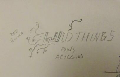
Wilder ideas were to use a blocky futuristic font with some decoration of the letters to suggest growth or wildness attacking or over-riding the solidity of the font.
The upshot of this was that I realised that my poor skills were quite inadequate to execute these ideas. And the idea of learning how to use the GIMP well enough to do them was almost as daunting.
A couple of people also suggested something which I had been considering myself: getting a professional to work on it. In the meantime, having something concrete and which I was moderately happy with would be a big help in providing a brief to real book cover designers. Options include crowdsourcing (like fiverr) or Goodreads cover specialists (there's a discussion here https://www.goodreads.com/topic/show/2193464-book-covers) or Kindle Groups designers.
Aesthetics aside. But let me leave the huge topic of aesthetics aside and consider what goes into a cover. Perhaps a little list is the best way to do this:
- Cover image
- Title
- Font: for the title, and the font for the rest of the text
- Author name
- “Tag-line”
- Series name and number, if appropriate
- Spine design
- Back cover design
- Back cover blurb – a short blurb, or a longer synopsis?
- Space for the barcode and ISBN
- Bio for yourself, and author photo
- Text and design for “ears” (the inside flaps if there will be a separate wrap-around cover)
I'll try to cover each of those topics briefly, below.
Cover image. This is crucial, as is the title. The cover is what you hope will catch the reader's eye, and interest. It needs to suggest what the book is about, and all the elements need to be harmonious. It's the first big hurdle you need to overcome in your quest to guide people to buying your book.
Title. What can I say about this? If the “elevator pitch” is a 25 word encapsulation of what your book is about, and the tag-line is an eight word hint, then the title is your novel distilled down to its essence, its heart. The approach you take for a title for fiction books is quite different to non-fiction: for the former, you want to rely on connotations and echoes, and for non-fiction you want to highlight what's unique about your book.
Font. The choice of font for the title is extremely important, too: although more so for fiction than non-fiction, I feel. I hadn't thought very much about this for my first attempt: I chose a cursive font because to me it suggested natural-ness (an echo of the “wild”), with a drop shadow so it could be read against the background. But one of the members of the Marrickville Writers Group with some cover design experience (hi, Lyn!) mentioned that drop shadow fonts for a title suggest the Mystery genre to readers (so, I should avoid that). There was general agreement that my choice of font for the title was wrong because it came across as too girly nor did it convey the futuristic angle.
The title font may benefit from being very eye-catching and highly decorative. The font for the rest needs to be more legible. Nor do you want a fruit salad of different fonts. That said, here is a site where you can get fonts for your cover: http://www.fontsquirrel.com/. An extra good thing about that site is that they also tag fonts, so you can search for things like “futuristic”: http://www.fontsquirrel.com/fonts/list/tag/futuristic.
Author name. Obviously you need to put the author's name there. But what name? Consider a pseudonym; consider variants of your name. My family actually suggested to me that “Luke Kendall” doesn't really roll off the tongue, whereas “Luke J. Kendall” is easier to say. And does the middle initial get put down with or without a period? A quick scan confirmed that, yes, the period is in.
“Tag-line”. I'm no expert on this: I bet Google would help you find good articles on how to do this. I'm pretty happy with what I came up with. The function of the tag-line is to help cue the potential reader in to the subject of the book. Since people had pointed out that “Wild Thing” could just as well refer to a wild party girl, adding the tag-line solved that particular problem.
Series name and number. One of my pet hates is not being able to easily find the order of books in a continuing series (Hi, Kim Harrison). Having to resort to Wikipedia and then using a permanent marker to add the number is not something I feel I should have to do. So, since I'm planning a whole series of books, I needed to add that somewhere. Oh, and then what to call the collection: Series, chronicles, report, archives, … in the end, I felt “dossier” best fit the subject matter.
Spine. If you're going to have a printed edition, then you need a design for the spine, and it needs to wrap around and fit with the front and back cover designs. As well, you will need to know how wide the spine will be, so that means you need to know how many pages, and the paper thickness. Fortunately, since I plan to use CreateSpace (https://www.createspace.com/Products/Book/), they make it easy by providing a calculator, once you've chosen the paper type: be aware, that cream and white paper have slightly different thicknesses!
Back cover design. If you have a printed edition, naturally. Have a look at some published books to see what goes here. Also, what goes here will be different if the cover will be loose and separate (this, with wrap-around “ears” where readers will expect to find the blurb, and perhaps the author bio), or if the cover will be more like a paper-back (integral to the book, no inside flaps). Also note that CreateSpace can't print on the inside of the cover, at present. So if you want your bio, it'll need to go on the back cover.
Back cover blurb. This is hurdle #3: if the potential reader likes the cover image and title, there's a good chance that the next thing checked out will be the blurb. So it pays to wordsmith this until it's as near perfect as you can make it. I think a similar effort to what's needed for writing poetry goes into this, since every word counts. Don't go overboard with this: the text will need to be very legible, regardless of the back cover beneath it, so it will need to be reasonably large, and thus reasonably short. Also, don't think that a synopsis is the same as the blurb: write a separate synopsis, don't just add to the blurb. Nor should you give away too much: you'll spoil the pleasure for the reader if you do more than provide them hints as to some of the twists. You certainly should notbe summarising your story. Yes, it's a fine art!
Barcode. Yep, you need to get an ISBN and a barcode for the ISBN, so leave space for them. If a book seller can't catalogue your book, there's no chance they'll add it to their inventory. Book retailers have enough problems: don't make more for them.
Bio. Readers are often interested in knowing a little about the author. Write something that gets across who you are: your personality. You may also want to include a nice photo of yourself.
Ears or flaps. You'll need some text if you plan on a printed book with a dust jacket, since the inside flaps is where readers will expect a blurb, or a longer synopsis if you wish. Have a look and see what other authors do.
Cover design. You have a wide range of options here. What I started with was a source of licensable images. I did some google searching and found Dollar Photoclub which suited my needs nicely. I was careful to read the license terms, to be sure I could use the images for a book cover design and for general promotion of my book, if I paid for licenses for the images (which were very reasonable, I thought). (I'm told you can also find free images, but the difficulty in being sure that they really are free is not worth the trouble, in my opinion.) Dollar Photo club also tags images, so you can search the large set of images by keywords, and then browse through the resulting images that match: that's a real help!
Other options are pre-made book covers: you browse through and buy the one you want, and they remove it so no one else will end up with the same cover design as yours (which is a danger when you rely on stock images). I'm sure there are several of these sites: I had a bit of a look at http://thebookcoverdesigner.com/product-category/premade-book-covers/ and http://www.thecovercollection.com/premadeebook-kindle-covers-fiction. These options are very cheap, and although you could get lucky and find something exactly right for your book, they generally won't look as good as a special design made just for your book.
Kindle Direct Publishing also have their own cover design “tool” where you can add the title etc. as well as an image. If your design skills are good enough, you might be able to get a reasonable design that way.
Another option is crowdsourcing (like fiverr), where you provide a brief for the work you want done and then people will vie for the work. I gather with fiverr, you specify the amount you want to spend, and the “bidders” will work to that. Obviously, if you set your price low, you will get fewer people vying for the work.
If you yourself have good design skills, you can do it yourself: but be aware that there are nuances to book cover design that you will need to learn: different genres have different expected styles, and if you design a cover that doesn't fit that, your book may well be overlooked or disregarded. Even the style of font and font effects matter. It's a specialist art. Here are a couple of articles you may find useful: 14 Tips for Good Kindle Cover Design/ and What Does Your Cover Say About Your Book/ if you want to take that route. Note that the first of those two links is someone who will also design a cover for you.
My own experience. So the upshot of making my own best attempt at a cover and learning a little about the topic was that I realised I should find someone better than myself to create the cover for my book.
Soon after coming to realise this, and primed by my heightened awareness of the subject of cover design, I noticed in passing on Twitter the covers for the series Norma Jean's School of Witchery by @RoseMontague, and thought “Wow, they're good”. I contacted her to ask who designed them and Rose very kindly put me in touch with Mirella Santana of Brazil, on Facebook as https://www.facebook.com/mirellasantana.digitalartist and at http://mirellasantana.deviantart.com/, and I was hooked.
I contacted Mirella and outlined what I wanted, and since she was interested, proceeded to prepare a brief.
Writing a design-brief.
I should point out that I
don't know the right way to do this; what I provided Mirella was an
early blurb for my book, a slightly longer synopsis, my bio, a short
background section for the world of the story, my attempts at my own
cover (along with a summary of their flaws), the cover details:
Title: Wild Thing
Tag line:
She's not what they planned
Subtitle:
The Leeth Dossier: vol 1
Author: Luke
J Kendall
as well as a list of ideas related to incidents in
the story that might form a suitable starting point for the cover
design, including a list of the key characters and the roles they
play. I was able to point Mirella at the model whose photos I'd
found, since she was a surprisingly good match to my own mental image
of my main character, and there was a good number of possibly
suitable images of her available.
After a while, Mirella provided me with some samples; and we went back and forth a little bit via Facebook, discussing them, as well as providing the extra information needed (like the physical dimensions of the printed book, including the number of pages). I made a few suggestions (in the initial image, the position of the dog and the monster suggested the main character might be a werewolf; and might even change into the monster too, rather than being threatened by it. Mirella's solution to that problem was much better than my suggestions, incidentally.
Later, I provided updated text for the back cover. Mirella added the period in “Luke J. Kendall” since I hadn't been aware of that convention; she also highlighted some of the text for the back cover for those readers who just want to skim the synopsis for interesting tidbits, rather than read it all.
Mirella also pointed me at a site where we could transfer large files to one another (https://www.wetransfer.com/), and I simply used Paypal to pay her for all her excellent work.
The whole process was enjoyable and pleasant; I did try hard to be responsive, and tried to answer all her questions promptly. I can certainly recommend Mirella: I think I was very lucky to find her. My situation was complicated by the fact that I was in the middle of working on splitting the book into two, and dreaming up the right “something” that might make the first half a compelling book in itself. At least the title still worked: but pretty much all the rest of the text on the cover had to change.
So what does the cover look like? Well, I had Mirella design two variants: one with and one without the dog. Here they are, side by side, just the front cover parts: (Incidentally, adding the image with the dog took almost two hours: looks like a bug in Blogger. The only way to make the with-dog image to appear at all was to first add it to a Picasa/Google Photos album, and then add it to the blog from there. Go figure!)

 OR
OR

So, I think it's appropriate to show you Mirella's design and finish with a poll (thanks to Matt Koble's post about How to Embed a Poll on a Blogger Post), since there is still one question open about the cover: do more people prefer the with-dog version, or the without-dog version? Please vote (unless I've already asked you in person)!
Do you prefer the design with the dog, or without?
And one last thing: Mirella said that if people had questions about the book cover design, she would be willing to answer them. Perhaps we could do them right here on this blog; but if you'd rather contact me to ask Mirella, that's fine, too.
